
The Shape of Recognition
Collectors frequently speak about craftsmanship, provenance and rarity, yet one of the most powerful forces in luxury is often discussed less directly. Before a collector understands the history of a house, studies its philosophy or learns the details of its production methods, they encounter its design. Shape, proportion, material selection and presentation communicate information long before words are read or specifications are examined. The strongest luxury brands understand this deeply. Their products become recognisable not because their logos are prominently displayed, but because their design language develops such consistency that recognition becomes instinctive.
This phenomenon extends across virtually every category of luxury. Certain silhouettes are recognised immediately. Certain proportions become inseparable from the houses that created them. Certain visual cues become so closely associated with a brand that they function as a form of identity in their own right. Over time, design evolves from a matter of aesthetics into a form of intellectual property. Collectors no longer identify the object by its name alone. They identify it by its shape.
This transformation rarely occurs by accident. It is the result of long periods of disciplined decision making. The most respected luxury houses understand that design is not simply decoration. It is communication. Every line, proportion and material choice conveys information about values, priorities and intent. A successful design language creates coherence across generations of products while remaining flexible enough to evolve. It becomes a visual manifestation of philosophy.
The relationship between design and identity is particularly important within collector culture because collectors often develop an appreciation for subtle distinctions. As knowledge deepens, attention shifts away from obvious signals and towards details that reveal character. Proportions become meaningful. Finishing becomes meaningful. The way materials interact becomes meaningful. Design becomes a language through which expertise can be communicated without explanation.
Design as the first impression of whisky
Whisky occupies an interesting position within this discussion because the liquid itself remains hidden until the bottle is opened. The collector's first interaction with a release therefore occurs through presentation. Bottle architecture, label design, typography, materials and packaging all contribute to the initial impression. These elements shape expectations before a single drop is poured. While flavour ultimately determines whether a whisky deserves admiration, design often determines whether it receives attention in the first place.
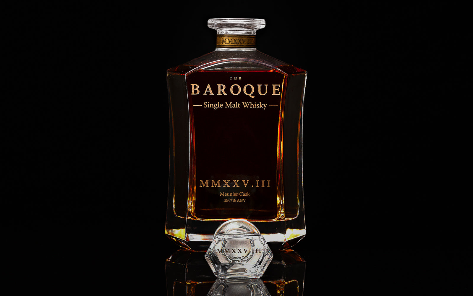
At The Baroque Single Malt Whisky Company, design is approached as an extension of provenance rather than a substitute for it. The objective is not to create packaging that overwhelms the whisky. The objective is to create presentation that reflects the values embodied within the release. Every design decision should reinforce the broader philosophy of the house, emphasising craftsmanship, collectability, provenance and restraint. The packaging should feel connected to the story rather than separate from it.
This philosophy becomes particularly important when considering the role of collectible objects. Collectors often preserve bottles long after they have been emptied because the object itself retains significance. The bottle becomes a record of a release, a reminder of an experience and a physical artefact within a larger collection. The same instinct extends to the objects that accompany the whisky, from Glencairn glassware to the hand-finished cigar trays within our barware range. Design therefore influences not only first impressions but also long term appreciation. A thoughtfully designed object remains engaging long after its original purpose has been fulfilled.
Design that transcends trends
The connection between design and permanence is explored throughout collector culture. Many of the most admired objects achieve longevity because their design transcends trends. They are not dependent upon temporary fashions or short lived aesthetic movements. Instead, they rely upon proportion, balance and coherence. Their appeal remains durable because it is rooted in principles rather than novelty. Collectors recognise this distinction because they understand that design which remains compelling over decades is fundamentally different from design intended to attract attention for a single season.
Building a visual legacy
This idea is particularly relevant to Baroque because the house is still defining its visual legacy. Established luxury brands often benefit from decades of accumulated design heritage. Emerging houses must build that heritage consciously. Every release contributes to the development of a recognisable identity. Every bottle becomes an opportunity to reinforce visual consistency while continuing to refine the language through which the house communicates. The challenge is not simply creating attractive packaging. The challenge is creating presentation that becomes unmistakably associated with the values of the house.
The Premium Range and Exceptional Cask Collection illustrate different expressions of this philosophy. While each release possesses its own identity, they remain connected through shared principles. The emphasis on provenance, finite releases and collector culture is reflected not only in the liquid but also in the way the object is presented. Design becomes another layer of storytelling, helping communicate the significance of the release before the collector engages with the whisky itself.
Collectors are particularly sensitive to these signals because they often view objects as part of broader collections rather than isolated acquisitions. A collection gains coherence when its objects share common themes, values or philosophies. Design plays an important role in creating this sense of continuity. It allows individual releases to feel connected to a larger narrative. The object becomes recognisable as part of a family while retaining its own distinct identity.
This relationship between individuality and consistency is one of the defining challenges of luxury design. Too much consistency can create repetition. Too much variation can create confusion. The most successful houses navigate this balance carefully. They maintain a recognisable visual language while allowing individual objects to express their own character. The result is a design identity that feels coherent rather than restrictive.
The Baroque Journal itself reflects this philosophy in a different form. Articles such as The Geography of Value explore the ideas that shape the identity of the house. Together, they create an intellectual framework that complements the visual language emerging through the releases themselves. Design and philosophy become mutually reinforcing. One communicates visually. The other communicates conceptually.
The Allocation Registry contributes to this continuity by creating a structured relationship between collectors and releases. As collectors engage with multiple bottlings over time, patterns begin to emerge. Familiar design cues become associated with familiar values. Recognition develops gradually. What begins as presentation evolves into identity.
Recognition without explanation
One of the most significant achievements any luxury house can accomplish is becoming recognisable without explanation. At that point, design ceases to be merely aesthetic. It becomes symbolic. The object communicates its origin, philosophy and standards through its presence alone. Collectors no longer require extensive introductions because the visual language already conveys the essential information.
At The Baroque Single Malt Whisky Company, we believe design should perform exactly this function. It should reinforce provenance, support collectability and communicate restraint. Most importantly, it should reflect the philosophy that guides every release. The objective is not to create packaging that demands attention. It is to create objects that reward attention.
Ultimately, design matters because recognition matters. Collectors are drawn to objects that possess a clear sense of identity. They value coherence because coherence reflects intention. When shape, material, presentation and philosophy align, the object becomes more than a container for a product. It becomes an expression of the house itself.
For collectors, that transformation is significant. It marks the point at which design ceases to be something that surrounds the object and becomes something that defines it. The strongest luxury houses understand this principle. Their products are recognised before their names are read, because their identity has already been communicated through design. In the world of collecting, few forms of recognition are more powerful than that.
Continue exploring
- Baroque Barware, glassware and cigar trays designed to be kept
- The Geography of Value
Leave a comment
This site is protected by hCaptcha and the hCaptcha Privacy Policy and Terms of Service apply.